Today, we are launching our new logo and name, as we move towards new horizons in our mission.
We’ve had our old logo for two years, and believe us, it still holds special meaning and many precious memories.
So why did we change it?
First. One good reason to update the style of logo is that our mission and vision are far, far broader than what the old logo was able to encapsulate. Our old name also did not do justice to the work we were doing, nor represent all the young people from different countries and backgrounds who came to volunteer with us. As a woke community, of course we have got to be inclusive, right? *wink*
Secondly, our previous logos were lovingly created inhouse. As we move towards a more regional outlook and outreach, we find that we need a logo that really speaks to a wider group of young people. And that means a professionally designed brand with a fresh(er) look and more vibrant palette.
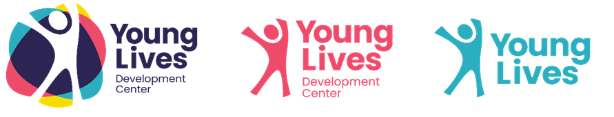
Take a look at our evolution.

Each one worked well during its time. The important thing about a brand and identity is that people should be able to remember us easily. And we found that an acronym is harder to remember than we thought. (‘Is it YDC? YDLC? YLCD?’)
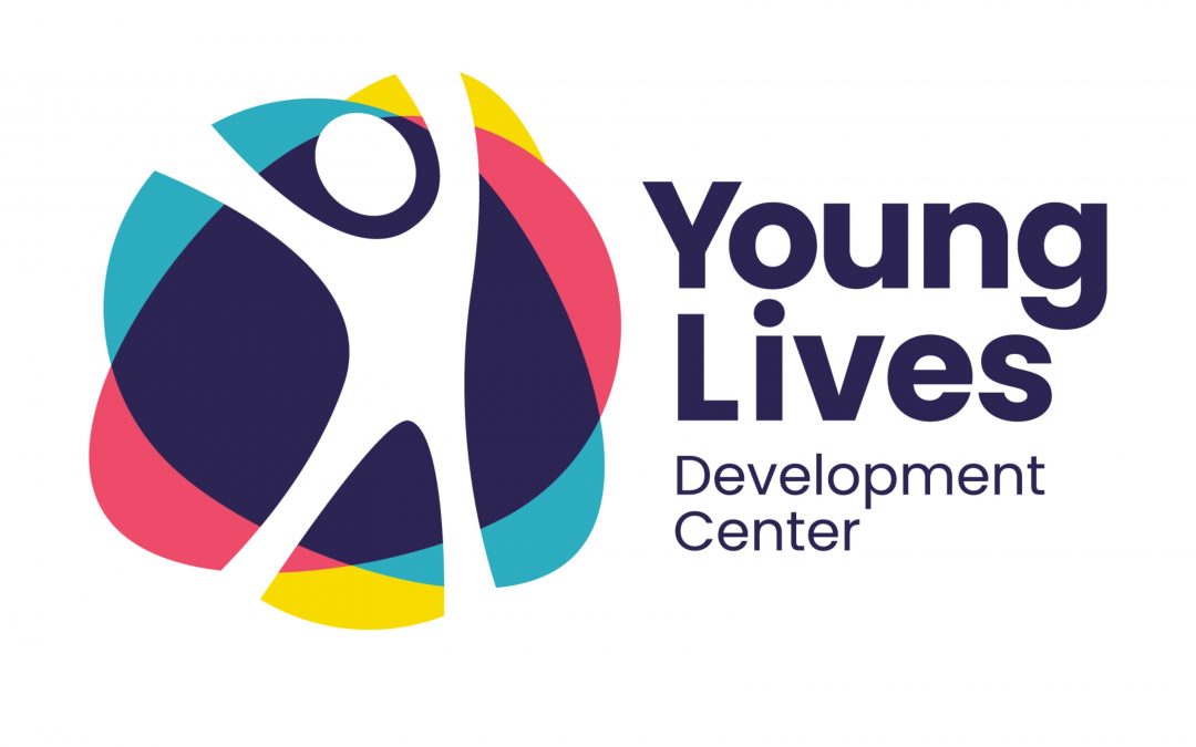
Which eventually led to the current version of our logo, and a name change. In keeping with our approach and vision, we changed Youth Livelihood to Young Lives, and figured we would go with that instead of the acronym to spare everyone the effort of getting it right. The struggle is real!
Our colour palette is from our parent organisation, Fondacio, becoming brighter, happier and funner, while still reflecting an organisation that works with and is almost entirely composed of young people.
The new logo also captures the spirit of our regional family: different colours coming together to create a single body, and always, always with the person at the center of it all.
More than that, it showcases the spirit of our youth clearly, in the form of a human icon leaping in joy.
The addition of a lockup mark also allows us more freedom in application, giving us lots of room to be creative and express ourselves better.
As you journey with us, watch us continue to evolve and grow around this new direction.
We are still here.
We are still the same young people, with the same spirit, working with young lives. And soon, there will be more of us (we hope).
Love, the Young Lives family.
TL;DR: We have a new name and logo!